Button
Displays important messages with optional actions.
API Reference
| Prop | Type | Default |
|---|---|---|
ariaHasPopup? | boolean | "menu" | "listbox" | "tree" | "grid" | "dialog" | - |
ariaPressed? | boolean | "mixed" | - |
ariaControls? | string | - |
ariaExpanded? | boolean | - |
ariaLabel? | string | - |
isDisabled? | boolean | false |
isLoading? | boolean | false |
trailingIcon? | ElementType | - |
leadingIcon? | ElementType | - |
text? | string | - |
subType? | ButtonSubType | ButtonSubType.DEFAULT |
size? | ButtonSize | ButtonSize.MEDIUM |
buttonType? | ButtonType | ButtonType.PRIMARY |
Usage Guidelines
Placement
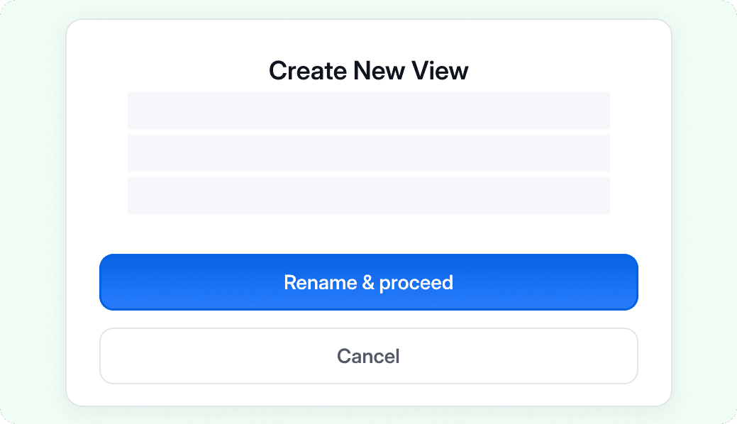
- The primary button would essentially garner the most attention in your layout ; use it sparingly and with absolute intent
- The position of buttons can vary depending on the layout.
This is supplementary text that can be used to add more details on this guideline point, apart from stating the do and don’t.
Do
Utilize the width of the smaller layouts to emphasise the actions

Don't
Do not leave awkward paddings on either side of buttons in smaller layouts like modals
This is supplementary text that can be used to add more details on this guideline point, apart from stating the do and don’t.

Do
Utilize the width of the smaller layouts to emphasise the actions

Don't
Do not leave awkward paddings on either side of buttons in smaller layouts like modals
Variants & Emphasis
Describes which style of this component to choose based on its importance, and how variants relate or combine.
Using combination of buttons This is supplementary text that can be used to add more details on this guideline point, apart from stating the do and don’t.

Do
Utilize the width of the smaller layouts to emphasise the actions

Don't
Do not leave awkward paddings on either side of buttons in smaller layouts like modals
How is this guide?